

INTRODUCTION
Screen Flows have always been functionally capable. They collect data, guide users through processes, trigger automation, and integrate with Salesforce records effectively. But for a long time, there has been a gap between what Screen Flows can do and how they feel to use.
Plain white screens. Undifferentiated text blocks. Instructions that blend into the background. Buttons that lack visual hierarchy. Layouts that work but do not engage. Flows that users complete because they have to — not because the experience respects their time and attention.
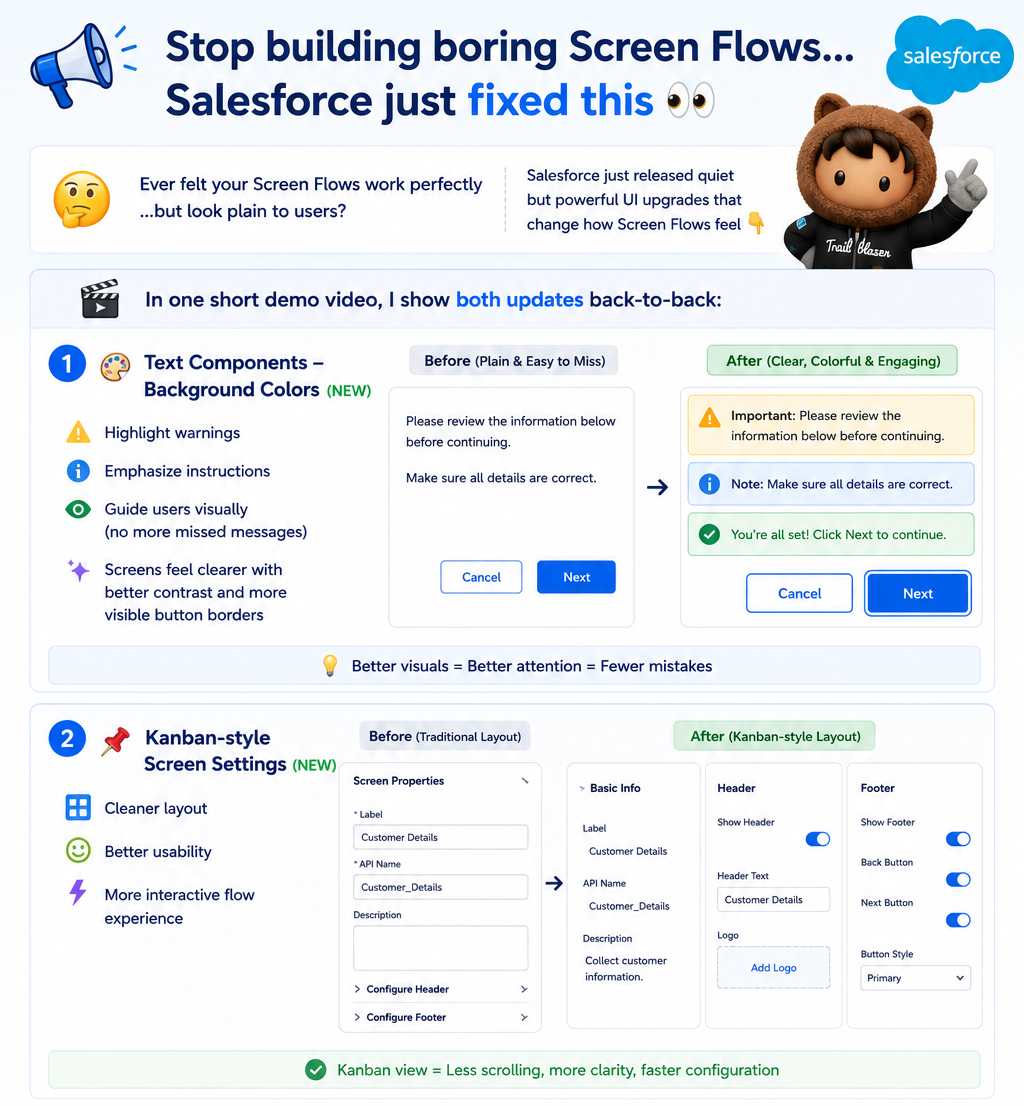
Salesforce has released two quiet but powerful UI upgrades that directly address this gap. The first brings background color support to Text components — giving admins the ability to highlight warnings, emphasise instructions, and guide users visually without custom code. The second introduces a Kanban-style layout for Screen Settings — creating a cleaner, more interactive way to configure and experience flow screens.
These are not cosmetic changes. They directly improve user attention, flow clarity, and ultimately the adoption and trust that determine whether a Screen Flow actually gets used the way it was intended.
This blog covers both updates — what they are, why they matter, how to use them, and the design principles that make them most effective.
THE CHALLENGE
Why Screen Flow UI Has Always Been a Limitation
Screen Flows are built and maintained by admins. The tools available to those admins for creating user interfaces have been, until recently, significantly more limited than what developers can build with custom LWC components or Experience Cloud pages.
The Visual Limitations That Created Poor User Experiences:
- All text rendered with the same default styling — no native way to make critical instructions visually distinct from general content
- Warning messages blended into surrounding text because no background color or visual container differentiated them
- Important notices were missed by users because nothing in the visual hierarchy drew attention to them
- Button borders were subtle to the point of being easy to overlook, especially for users unfamiliar with the flow interface
- Screen layouts were configured in settings panels that required navigating between properties rather than seeing the full picture at once
The Real Cost of Poor Screen Flow UI:
Poor visual design in Screen Flows creates problems that extend beyond aesthetics. When users miss instructions because they blend into the background, they make mistakes that require correction. When warnings are not visually distinct, users proceed through consequential decisions without the awareness the flow designer intended. When the layout feels disorganised, users lose confidence in the tool and the process it represents.
The result is flows that work technically but fail practically — because user experience is a functional requirement, not a nice-to-have.
What Was Required Before These Updates:
- Custom LWC components built specifically to render styled text boxes, highlighted sections, or visually distinct call-out areas inside flow screens
- Developer involvement for what should be admin-configurable UI decisions
- HTML markup in Display Text components as a workaround — fragile, inconsistent across themes, and inaccessible
- Accepting that Screen Flows would always look plainer than what was possible with custom development
Both Spring ’26 updates address these limitations directly and natively.
UPDATE ONE — BACKGROUND COLORS FOR TEXT COMPONENTS
Visual Hierarchy in Screen Flows — Finally Native
The first update brings background color support to Text components in Screen Flows. Admins can now apply background colors to text blocks — creating visually distinct sections that draw user attention, communicate priority, and guide users through the flow with clear visual hierarchy.
What This Enables:
- Highlight warning or caution content with a yellow or orange background so it is impossible to miss
- Emphasise important instructions with a colored background that separates them from surrounding content
- Create visual sections within a screen that group related content and guide the user’s eye through the information
- Add contrast between different types of content — instructions, warnings, confirmations, informational notes — without requiring custom components
- Improve button visibility with better contrast and more visible button borders that make interactive elements immediately recognisable
Why Visual Hierarchy Matters in Flow Design:
Human attention is not evenly distributed. Users scanning a screen do not read every word with equal focus — they scan for visual landmarks that tell them where to look and what matters. When everything on a flow screen has the same visual weight, users miss things. When visual hierarchy is applied thoughtfully, users naturally notice what the designer intended them to notice.
Background colors on Text components are a direct tool for controlling that hierarchy. A yellow background on a warning block says — before the user reads a single word — “this is different, this matters, pay attention here.” A colored background on an instruction section separates guidance from input fields in a way that white-on-white design cannot achieve.
How to Configure Background Colors:
Step 1: Add or Select a Text Component on a Flow Screen
– In Flow Builder, open a Screen element
– Add a new Text component or select an existing one
on the screen canvas
Step 2: Open the Component Properties Panel
– With the Text component selected, the properties
panel appears on the right side of the canvas
– Look for the Background Color or Styling section
within the component properties
Step 3: Select a Background Color
– Choose from the available color options or enter
a custom color value
– Consider the semantic meaning of the color:
Yellow / Amber — warning or caution content
Red / Light red — error or critical alert content
Green / Light green — success or confirmation content
Blue / Light blue — informational or instructional content
Neutral / Gray — secondary or supplementary content
Step 4: Review the Visual Result in Preview Mode
– Use Flow Builder’s Preview mode to see the background
color rendered as users will see it
– Check contrast — ensure text remains readable against
the chosen background color
– Verify the color communicates the intended priority level
Step 5: Apply Consistently Across the Flow
– Establish a consistent color scheme for your flow:
one color for warnings, one for key instructions,
one for informational content
– Consistency builds user familiarity — once users learn
what yellow backgrounds mean, they interpret them
correctly without reading the content first
Practical Color Application Patterns:
Warning Content:
Background: Light yellow or amber
Use for: Consequences of actions, irreversible steps,
data that will be overwritten, escalation impacts
Example: “Warning: Clicking Next will cancel all open
tasks on this record. This cannot be undone.”
Key Instructions:
Background: Light blue
Use for: Steps the user must complete correctly,
required information, process guidance
Example: “Please complete all fields below before
proceeding. Incomplete submissions cannot
be processed.”
Confirmation Content:
Background: Light green
Use for: Successful completions, positive confirmations,
approved states
Example: “Your request has been submitted. A confirmation
email will be sent to the address on file.”
Informational Notes:
Background: Light gray or neutral
Use for: Supplementary context, optional reading,
reference information
Example: “For questions about this process, contact
the HR team at hr@company.com.”
Button Border Visibility Improvement:
Alongside background color support, this update also improves button border contrast and visibility within Screen Flows. Buttons are more clearly defined as interactive elements — the visual affordance that tells users “this is something you can click” is stronger than in previous releases.
This is particularly valuable for flows used by users who are less familiar with the Lightning Experience interface, where subtle button styling could previously lead to confusion about what was interactive and what was informational.
UPDATE TWO — KANBAN-STYLE SCREEN SETTINGS
A Cleaner, More Interactive Way to Configure and Experience Flow Screens
The second update introduces a Kanban-style layout approach to Screen Settings in Flow Builder. This changes how flow screen configuration is displayed and interacted with — creating a cleaner, more visual layout experience that improves both the admin’s ability to design screens and the user’s experience of the resulting flow.
What Kanban-Style Screen Settings Means:
The Kanban-style approach organises screen elements and settings in a more visual, card-based layout rather than the traditional list-based properties panel. This creates:
- A cleaner visual representation of how screen content is organised
- Better usability when configuring multiple screen elements — seeing them arranged in a layout-aware way rather than a linear list
- A more interactive configuration experience that reflects the visual result more closely than the previous settings approach
- Improved spatial understanding of how screen content will appear to users
Why This Improves the Screen Flow Experience:
Flow design is fundamentally a visual task — you are arranging content on a screen that users will see and interact with. The traditional list-based settings panel creates a disconnect between the configuration interface and the visual result. You configure properties in a list, then switch to preview mode to see how they render, then switch back to adjust.
The Kanban-style layout reduces this disconnect by bringing the configuration closer to the visual representation. You see the arrangement of elements as you configure them — making decisions about layout, order, and visual hierarchy more intuitively and with less switching between configuration and preview modes.
How to Use the Kanban-Style Screen Settings:
Step 1: Open a Screen Element in Flow Builder
– In Flow Builder, open any Screen element by
double-clicking it on the canvas, or create
a new Screen element
Step 2: Explore the Updated Screen Settings Layout
– In the Screen element editor, look for the updated
layout in the settings or properties area
– The Kanban-style view organises screen components
in a more visual, card-based arrangement
– Components are displayed in a way that reflects their
position and relationship on the actual screen
Step 3: Arrange and Configure Components in the Layout View
– Interact with components in the Kanban-style view
to configure their position, properties, and content
– The visual layout makes it easier to understand
how components relate to each other spatially
– Reordering components is more intuitive in the
visual layout than in a traditional list
Step 4: Use the Layout View for Design Decisions
– When deciding how to organise content on a screen —
what should appear first, what should be grouped,
what needs visual separation — use the Kanban view
to make those decisions with visual context
– The layout view reduces the need to constantly
switch to preview mode to see how decisions render
Step 5: Validate in Preview Mode Before Activation
– Even with the improved Kanban-style layout view,
always validate the final screen design in Flow
Preview mode to confirm it renders as intended
for users
Benefits for Different Flow Design Scenarios:
For Complex Screens With Many Components: The Kanban-style layout makes it significantly easier to understand the overall organisation of a screen with many elements. Instead of scrolling through a long list of component configurations, you see them arranged spatially — which reflects how users will actually experience the screen.
For Collaborative Flow Design: When working with stakeholders on flow screen design — showing them how a screen will be organised before building it — the Kanban-style view provides a more intuitive representation that non-technical stakeholders can engage with more effectively.
For Screen Redesign and Iteration: When iterating on an existing screen’s layout — moving components, regrouping content, adjusting the visual order — the Kanban-style view makes these changes more efficient by giving you spatial context for each decision.
COMBINED IMPACT ON SCREEN FLOW QUALITY
What These Two Updates Mean for Screen Flow Design and Adoption
Used together, background color support and Kanban-style Screen Settings raise what is achievable in Screen Flow design without custom development.
The Before and After for Screen Flow Quality:
Before These Updates:
- Plain white screens with undifferentiated text content
- Critical warnings visually indistinguishable from general instructions
- Users miss important information because nothing draws their attention
- Buttons and interactive elements lack sufficient visual affordance
- Screen configuration requires constant switching between settings and preview
- Flows look functional but not professional
After These Updates:
- Visually structured screens with clear content hierarchy
- Warnings and key instructions highlighted with background colors that guide attention
- Users see what matters because visual design communicates priority
- Interactive elements are more clearly defined and recognisable
- Screen configuration is more intuitive with spatial layout context
- Flows look and feel like purpose-built tools
Impact on User Adoption:
User adoption of Screen Flows correlates directly with user experience quality. Flows that feel professional, clear, and well-organised are used correctly and consistently. Flows that feel plain and undifferentiated create confusion, errors, and resistance.
Background colors and improved screen layout are direct levers for adoption quality. When users trust the tool because it communicates clearly and looks professionally designed, they follow the process it guides them through. When they do not trust it, they find workarounds or avoid it.
Impact on Admin Autonomy:
Both updates expand what admins can achieve independently. Background color support removes the need for custom LWC components to create visually distinct content sections. Kanban-style Screen Settings makes complex screen design more manageable without developer assistance. Together, they push the boundary of what professional-quality Screen Flow design looks like in the hands of an admin.
REAL-WORLD USE CASES
Where These Updates Make the Most Difference
Use Case 1: Guided Onboarding Flow With Visual Instructions
A new employee onboarding flow walks users through ten steps of setup and acknowledgement. Previously, all instruction text had the same visual weight — users frequently skipped required steps or missed critical information.
With background color support:
- Blue background on instruction sections — “Complete the following fields to set up your profile”
- Yellow background on warning sections — “The information you enter here will be used for payroll. Please verify accuracy before continuing”
- Green background on completion confirmations — “Step 3 of 10 complete. Your emergency contacts have been saved”
Users now navigate the flow with clear visual guidance. Skip rates on critical steps drop. Error rates in data entry decrease because warnings are actually noticed.
Use Case 2: Data Quality Review Flow for Sales Reps
A data quality flow prompts sales reps to review and update account information. Previously, the flow looked like a simple form — reps rushed through it without reading the context that explained why each field mattered.
With background colors:
- Amber background on fields that have been flagged as potentially outdated — drawing attention to the specific records that need careful review
- Blue background on guidance text explaining what each section affects downstream
With Kanban-style Screen Settings:
- Screen layout designed to group related fields visually — company information together, contact information together, financial information together
- The spatial grouping communicates structure that the previous linear layout obscured
Use Case 3: Approval Flow for Finance Team
A purchase approval flow presents invoice details and requests approval decisions. Previously, the approver had to read carefully to distinguish the invoice summary from the approval instructions from the consequence warnings.
With background colors:
- Neutral gray background on the invoice summary section — “here is the data”
- Blue background on the instruction section — “here is what you need to do”
- Yellow background on the consequence warning — “here is what happens when you approve or reject”
- Button borders that clearly delineate the Approve and Reject actions as distinct interactive elements
Approval accuracy improves. Incorrectly approved invoices decrease. Approvers report the flow is clearer and faster to complete.
KEY LEARNING
What These UI Updates Teach Us About Flow Design
Learning 1: UI Is a Functional Requirement, Not a Cosmetic One The most important lesson from these updates is the one that should have been obvious all along: how a Screen Flow looks directly affects how well it works. Visual hierarchy, color differentiation, spatial organisation — these are not decorative choices. They determine whether users notice critical information, follow instructions correctly, and trust the tool enough to use it as intended.
Learning 2: Consistency in Color Usage Builds User Literacy Background colors are most effective when used consistently throughout a flow and across flows in an org. When users learn that yellow always means warning and blue always means instruction, they interpret visual cues before reading content. This is efficient for users and powerful for flow designers. Inconsistent color usage destroys this learned literacy.
Learning 3: The Gap Between Admin-Built and Developer-Built Is Closing Each release that adds native styling capabilities to Flow Builder narrows the gap between what admins can produce declaratively and what developers could previously achieve only with custom code. Background colors are a direct example — a capability that previously required a custom LWC component is now a native configuration option.
Learning 4: Visual Feedback Reduces Errors Flows where users receive clear visual feedback about what section they are in, what is required, and what the consequences of their actions are produce fewer errors than flows without that feedback. This is well-established UX research applied to the Salesforce context. Investing in visual clarity is investing in data quality.
Learning 5: Layout Tools That Match the Output Are More Efficient The Kanban-style Screen Settings improvement reflects a principle that applies broadly to design tooling: the interface for building something should resemble the thing being built. When screen configuration looks more like the screen users will see, design decisions are made faster and with fewer surprises at preview time.
KEY INSIGHT
Screen Flows That Respect User Attention Get Used Correctly
The fundamental insight behind both of these updates is simple: users pay attention to what stands out. Flows that give every piece of content equal visual weight are asking users to work harder than necessary — to read everything carefully because there is no visual signal about what matters most.
Background colors create visual signals. Kanban-style layout creates spatial organisation. Together, they give Screen Flow designers the tools to build flows that respect user attention — that guide the eye, communicate priority, and make it easy to do the right thing.
Flows built with these tools get used correctly more often. Users make fewer mistakes. Adoption improves. Trust in the process builds. That is the return on investing in Screen Flow UI quality — and it is now achievable without a single line of custom code.
Final Thought
Salesforce has been steadily improving what admins can build with Screen Flows — and these two updates continue that trajectory in exactly the right direction.
Background color support for Text components is available now. Open your most-used Screen Flow and identify the one section where users most frequently make mistakes or miss critical information. Add a background color to that section. Preview it. The improvement in visual clarity will be immediately obvious.
Explore the Kanban-style Screen Settings for your next flow build. Use the spatial layout view to make design decisions rather than just to review them after the fact.
Your Screen Flows work. Now make them feel like they were designed for the people who use them. These updates make that possible without building a single custom component.