

INTRODUCTION
Salesforce Spring ’26 continues to deliver thoughtful improvements to Screen Flows, and this release brings two updates that are simple in concept but genuinely impactful in practice.
The first is the Message Component — a native way to display success, error, warning, and info messages directly inside Screen Flows. No more Display Text workarounds. No more complex conditional visibility logic just to show a user that something went wrong or succeeded.
The second is a File Preview enhancement — users can now preview files directly inside a Screen Flow without downloading them or opening a new tab. For review, confirmation, and approval workflows, this creates a cleaner and more professional user experience without any additional configuration effort.
Neither of these updates is dramatic on its own. Together, they continue the pattern of Spring ’26 reducing the gap between what Screen Flows can deliver and what users and admins actually need from them.
This blog covers both updates — what they are, what problems they solve, how to use them, and the best practices for getting the most from each.
THE CHALLENGE
The Gaps These Two Updates Fill in Screen Flow Design
Challenge 1: Communicating Outcomes and Alerts in Screen Flows Was Unnecessarily Complex
Screen Flows frequently need to communicate status to users — a record was saved successfully, a validation failed, a warning about a downstream impact, an informational note about what will happen next. These are standard UX requirements that appear in almost every non-trivial Screen Flow.
Before the Message Component, meeting this requirement required workarounds:
- Display Text components styled with manual HTML or formula-based content to approximate different message types
- Complex conditional visibility rules to show different Display Text blocks based on flow variable states
- Custom LWC components built specifically to render styled message boxes inside flows
- Formula fields generating emoji or symbols to visually distinguish message types when styling was not available
Each workaround added complexity to the flow design, created maintenance overhead, and produced inconsistent results across different browsers, themes, and Lightning Experience configurations. The workaround component needed to be maintained separately from the flow logic it was meant to support.
Challenge 2: File Preview Inside Screen Flows Required Leaving the Flow
Screen Flows used for document review, approval processes, and file confirmation workflows need users to see the content of files — not just the file name. Before the Spring ’26 File Preview enhancement, the options were limited:
- Display the file name only, with no way to view content without leaving the flow
- Provide a download link, requiring the user to download the file, open it externally, then return to the flow to continue
- Open the file in a new browser tab, splitting the user’s attention and creating navigation friction
- Build a custom LWC component that rendered file previews inside flow screens
For review and approval flows where the user’s decision should be informed by the file content, these limitations created either poor UX or additional development effort. Neither outcome is acceptable for what should be a straightforward capability in a document-centric workflow.
UPDATE ONE — THE MESSAGE COMPONENT
Native Success, Error, Warning, and Info Messages in Screen Flows
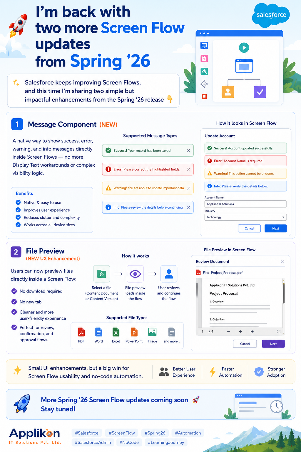
The Message Component is a new native Screen Flow component in Spring ’26 that displays styled alert messages directly on flow screens. It supports four message types — each with distinct visual styling that matches the Salesforce Lightning Design System:
- Success — green styling, used to confirm that an action completed successfully
- Error — red styling, used to communicate that something went wrong or a validation failed
- Warning — yellow/orange styling, used to alert users to a condition that requires attention
- Info — blue styling, used to provide informational context without implying a problem
What Makes This Different From Display Text:
Display Text is a versatile component, but it is fundamentally a text renderer. It does not natively support message type semantics — the visual distinction between a success confirmation and an error alert. Achieving that distinction with Display Text required HTML markup, formula-based conditional content, or custom components.
The Message Component is purpose-built for alert-style communication. It renders with the correct SLDS styling for each message type automatically. It is accessible — screen readers interpret the message role correctly. And it is configurable without any formula or HTML knowledge.
Configuration Options:
- Message Type: Success, Error, Warning, or Info — controls the visual styling and icon
- Message Text: The content of the message — supports static text or flow resource references for dynamic content
- Visibility: Can be conditionally shown or hidden based on flow variables — show an error message only when an error variable is populated, show a success message only after a successful DML operation
How to Use It:
Step 1: Add the Message Component to a Screen Element
– In Flow Builder, open or create a Screen element
– In the component palette on the left, search for Message
– Drag the Message component onto the screen canvas
Step 2: Configure the Message Type
– In the component properties panel, select the Message Type:
Success — for positive confirmations
Error — for failure or validation messages
Warning — for caution or impact alerts
Info — for neutral contextual information
Step 3: Set the Message Text
– Enter static text directly, or
– Use a flow resource reference to display dynamic content:
{!ErrorMessage} — displays the content of an ErrorMessage
text variable
{!RecordName} + ‘ was saved successfully’ — combines
static and dynamic content
Step 4: Configure Conditional Visibility (Optional)
– Set the component’s visibility condition to control when
the message appears
– Example: Show the Error message component only when
{!HasError} equals true
– Example: Show the Success component only when
{!RecordCreated} equals true
Step 5: Test in Preview Mode
– Preview the flow and test the scenarios that should
trigger each message type
– Verify the correct styling appears for each message type
– Confirm dynamic content populates correctly
Common Use Cases:
- Confirmation message after a form submission: “Your request has been submitted successfully.”
- Validation error after checking business rules: “This account already has an open case. Please review before creating a new one.”
- Warning before a destructive action: “Clicking Next will cancel all pending tasks associated with this record.”
- Informational context at the start of a process: “This flow will update all related contact records. The process may take a few moments.”
Before and After Comparison:
Before the Message Component, displaying a conditional error message required:
- A text variable to store the error message content
- A formula or assignment element to populate the variable when an error occurs
- A Display Text component with HTML formatting to approximate error styling
- A conditional visibility rule on the Display Text component
- Ongoing maintenance as HTML rendering varied across configurations
After the Message Component:
- A Message component set to type Error
- A conditional visibility rule referencing the error condition variable
- Static or dynamic message text configured directly in the component properties
- Consistent SLDS styling automatically, no HTML required
UPDATE TWO — FILE PREVIEW ENHANCEMENT
Preview Files Directly Inside Screen Flows — No Download, No New Tab
The File Preview enhancement in Spring ’26 allows users to view file content directly within a Screen Flow interface. When a flow displays a file — a contract, a document, an image, a PDF — the user can preview the full content inline without downloading the file or navigating to a new browser tab.
What This Looks Like in Practice:
A user reaches a screen in an approval flow. The screen displays the document that requires their approval. Previously, they would see a file name with a download link. Now, the file renders inline — they can read the full document, scroll through its pages, and see its complete content without leaving the flow screen. They make their decision and click Next to continue the flow.
The entire review and decision process happens within a single, uninterrupted flow session.
Why This Matters for Flow UX:
The quality of a Screen Flow’s user experience is measured by how much it respects the user’s attention and context. Every time a user has to leave the flow — to download a file, open a new tab, find the file in their downloads folder, open it, review it, close it, and return to the flow — is an interruption that reduces focus and increases the risk of errors or abandonment.
File preview eliminates this interruption for file-centric workflows. The user stays in the flow. The flow stays coherent. The experience is professional and efficient.
How to Use It:
Step 1: Add a File Upload or File Display Component to Your Screen
– In Flow Builder, open a Screen element that should
display files for user review
– Add a File Upload component if users will be uploading
files within the flow, or
– Use a Get Records element before the screen to retrieve
existing ContentDocument records to display
Step 2: Configure File Display for Preview
– In the component properties, enable the file preview
capability
– Map the file reference to the ContentDocument or
ContentVersion record retrieved by your Get Records element
Step 3: Position the Preview Component on the Screen
– Place the file preview component in a logical position
on the screen — typically above or alongside any
decision or approval actions the user needs to take
– Consider the screen layout to ensure sufficient space
for the file content to be readable
Step 4: Test With Representative File Types and Sizes
– Preview the flow and test with the file types your
users will actually encounter — PDFs, images, Word docs
– Verify the preview renders correctly for each file type
– Test with realistic file sizes to confirm performance
is acceptable within the flow context
Step 5: Confirm the User Journey Is Smooth
– Walk through the complete flow as a user would
– Verify that previewing the file does not disrupt
the flow state or require navigation away from the screen
– Confirm that after reviewing the file, the user can
continue the flow normally
Best Flow Types for File Preview:
- Document approval flows — user reviews a contract or policy document and approves or rejects
- Case file review flows — support agent reviews an attachment submitted by a customer before taking action
- Onboarding document confirmation flows — new employee reviews and acknowledges receipt of policy documents
- Invoice or purchase order review flows — finance team reviews a document before approving payment
- Quality check flows — inspector reviews photographic evidence before marking an inspection complete
COMBINED IMPACT ON SCREEN FLOW DESIGN
What These Two Updates Mean for No-Code Automation Quality
Used together, the Message Component and File Preview enhancement raise the quality ceiling for what Screen Flows can deliver without custom development. Both updates address specific friction points that previously required workarounds — and removing those workarounds simplifies flow design, reduces maintenance, and produces better user experiences.
Impact on Flow Complexity:
Flows that previously required custom LWC components for message display or file preview can now be built entirely with native components. Native components are easier to configure, easier to maintain, and do not introduce dependencies on custom code that must be updated when Salesforce releases change the LWC framework.
Impact on Admin Autonomy:
Both updates expand what admins can build and maintain independently without developer involvement. A message component that previously required a custom LWC is now a drag-and-drop configuration. A file preview that previously required a developer-built component is now a native capability.
This directly supports the principle that Screen Flows should enable admins to build complete, professional user experiences without requiring developer resources for common UI requirements.
Impact on User Experience:
Users interacting with Screen Flows built with these components experience:
- Clear, visually distinct feedback about the outcomes of their actions
- Uninterrupted file review within the flow session
- Consistent styling that matches the rest of the Lightning Experience interface
- Flows that feel polished and purpose-built rather than like workarounds assembled from available parts
REAL-WORLD USE CASES
Where These Updates Apply in Practice
Use Case 1: Contract Approval Flow With Document Preview and Status Messages
A legal operations team uses a Screen Flow for contract approval. The flow presents the contract document for review, collects the approver’s decision and comments, and updates the contract record accordingly.
With Spring ’26 updates:
- The File Preview component displays the contract PDF inline — the approver reads it without leaving the flow
- If the approver selects Reject, a Warning Message component appears: “Rejecting this contract will notify the account team and pause the deal stage update. Are you sure?”
- After the approver confirms their decision and the flow updates the record, a Success Message component confirms: “Contract status has been updated. The account team has been notified.”
The entire workflow — document review, decision, confirmation — happens within a single, coherent flow session with appropriate visual feedback at each stage.
Use Case 2: Case File Review for Support Agents
A support team uses a Screen Flow to guide agents through case resolution. When a case has an attachment, the flow displays the file for agent review before presenting resolution options.
With Spring ’26 updates:
- The File Preview component shows the customer’s attached image or document inline on the review screen
- If the attachment is missing or cannot be retrieved, an Error Message component explains the issue: “The attachment could not be loaded. Please check the case record directly before proceeding.”
- If the agent selects a resolution that requires escalation, a Warning Message component confirms: “Escalating this case will reassign it to the specialist queue and change the SLA timer.”
Use Case 3: Employee Onboarding Document Acknowledgement
An HR team uses a Screen Flow for new employee document acknowledgement during onboarding. Each policy document is presented for review before the employee confirms receipt.
With Spring ’26 updates:
- The File Preview component displays each policy document inline — employees read the actual document, not just its name
- An Info Message component at the top of each screen provides context: “Please read this document carefully. Your acknowledgement will be recorded in your employee record.”
- A Success Message component after each acknowledgement confirms: “Your acknowledgement has been recorded for [Document Name].”
KEY LEARNING
What These Updates Teach Us About Screen Flow Evolution
Learning 1: Native Components Always Beat Workarounds Every time Salesforce adds a native component that replaces a common workaround, the ecosystem benefits — simpler flows, more consistent results, lower maintenance overhead, and better admin autonomy. The Message Component is a clear example of this pattern. If you have flows using Display Text or custom LWC for styled messages, replacing them with the Message Component is worthwhile maintenance.
Learning 2: UX Continuity Is a Design Principle, Not a Nice-to-Have The File Preview enhancement reflects a UX principle that should inform all Screen Flow design: keep users in the flow. Every interruption — every moment where a user has to leave the flow context, find something, return, and reorient — degrades the experience and increases error risk. Features that enable UX continuity have disproportionate impact on flow quality.
Learning 3: Small Enhancements Compound Into Better Platforms Neither the Message Component nor the File Preview enhancement is a major platform capability. They are targeted improvements to specific friction points. But Salesforce’s consistent delivery of these targeted improvements across releases is what makes the platform incrementally better for admins and users with every release. Staying current with these updates is how you benefit from that investment.
Learning 4: Screen Flow Capability Is Accelerating The pace of Screen Flow enhancement across recent releases reflects Salesforce’s investment in making Screen Flows a first-class application development tool — not just a wizard builder. Each release adds capabilities that push Screen Flows closer to what custom development could previously achieve exclusively.
KEY INSIGHT
Small UI Enhancements, Big Win for No-Code Automation
The Message Component and File Preview enhancement are not headline features. They will not appear in keynote presentations or trend on social media. But they solve real, daily problems that admins and developers have been working around for years.
That is exactly the kind of improvement that makes a platform genuinely better to work with over time. Features that eliminate workarounds. Components that do what users actually need without requiring custom code. UI capabilities that make flows feel professional without developer involvement.
Screen Flows are increasingly capable of delivering experiences that previously required custom development. Spring ’26 takes two more steps in that direction — and both are available in your org right now.
Final Thought
Two updates. Both native. Both are immediately available without additional configuration or custom code.
If you have Screen Flows currently using Display Text workarounds for styled messages, replace them with the Message Component. The result will be cleaner flows, more consistent styling, and better accessibility.
If you have review or approval flows where users currently have to download files or open new tabs to see content, add the File Preview component. The result will be a more coherent, professional flow experience that keeps users focused and reduces friction.
More Spring ’26 Screen Flow updates are coming — but these two are ready for you to explore right now. Go try them in your org.